Duke Energy Back-to-School Safety Tips Responsive Email
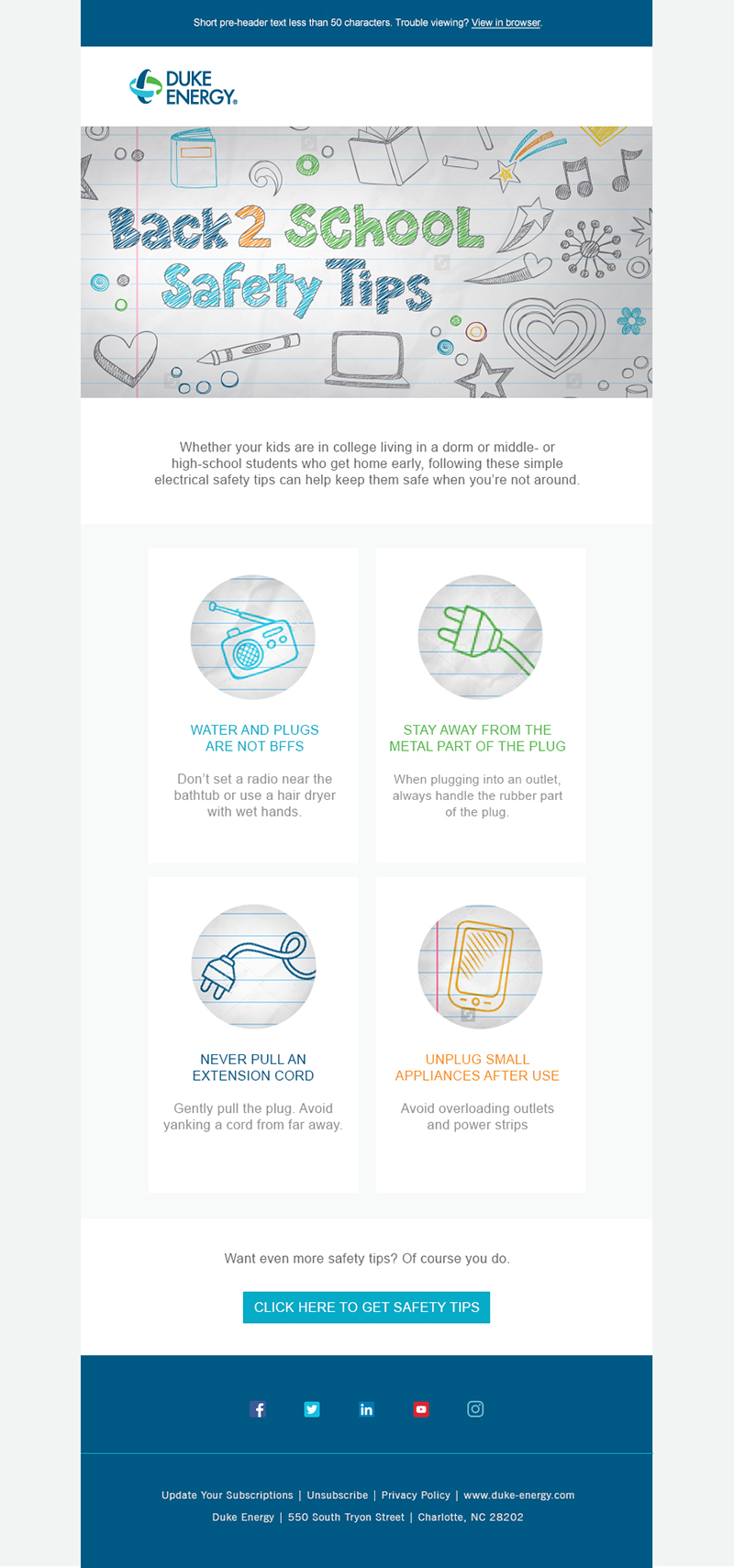
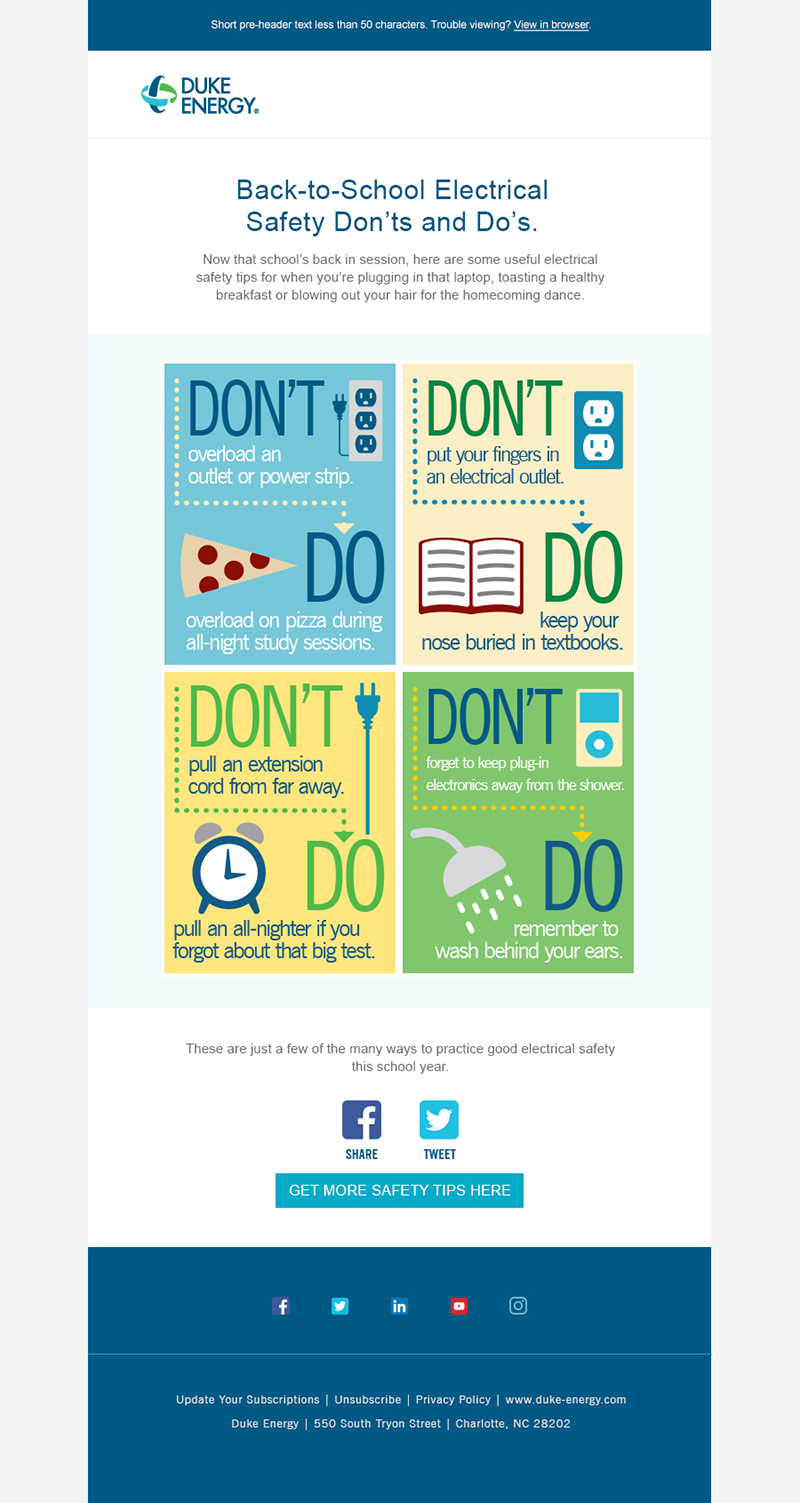
These are desktop and mobile-sized drafts for an email alerting students and parents to safety tips. It was released when students were headed back to elementary, middle and high school, and college, so the artwork needed to encompass as wide an age range as possible, while still being fun and playful.
Version 1
This was loosely based on the aesthetic of the doodles seen throughout the movie Napoleon Dynamite. It seemed to be a good solution to a school theme that could apply across a large age range; everyone doodles in class, from kindergarten through college!


Version 2
This took a more infographic approach, with some do’s and don’ts and appropriate imagery set around the typography.

