Chris Hannibal Site Redesign
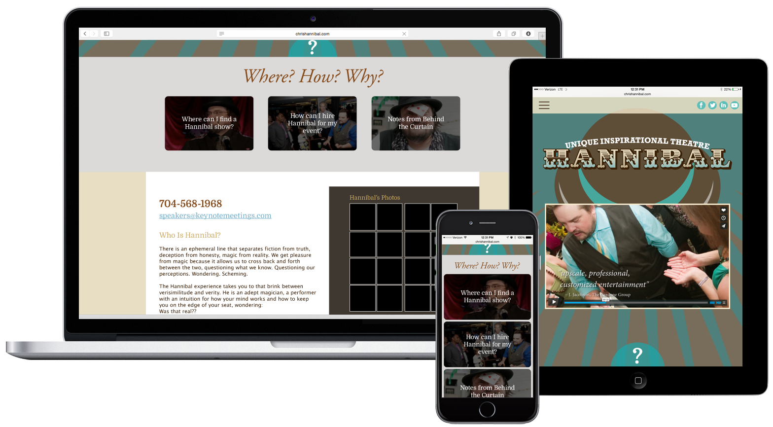
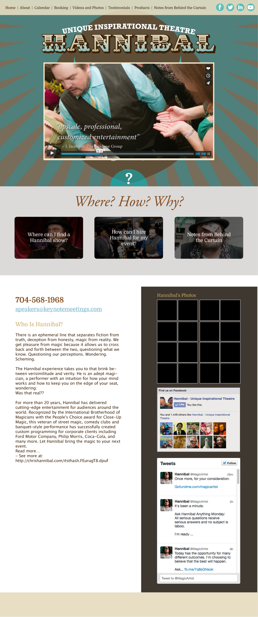
Chris Hannibal has been a client for several years now, and his website has gone through a few revisions and upgrades. This is a redesign that is in progress to make his site responsive, and to update the look a bit.

Homepage

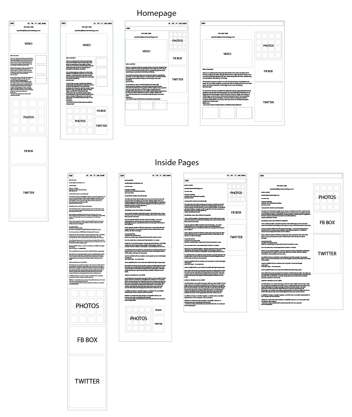
The content of the site will stay the same, only the interface will be changing. These are initial wireframes that work out how to organize the already existing content on Hannibal’s site. The layout was considered starting from the smaller, more basic mobile display, then worked out from there to larger display sizes.
Wireframes
