Compucom Site Redesign
In January of 2018, I started work on a project to redesign the CompuCom corporate site. This was a sitewide refresh, including a complete redesign of the homepage. Our goals were to create a modern look and feel, bring the site into the newly established brand standards, declutter the and streamline the site, as well as simplifying the dropdown navigation.
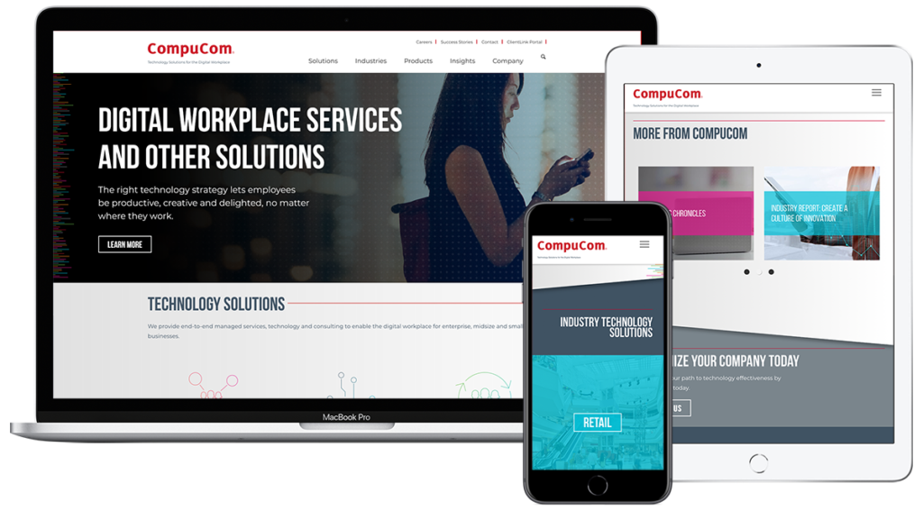
The site was built on Drupal and needed to stay within the same template, so all the changes made were within that framework. The homepage was totally overhauled to give it a modern look and feel – there was discussion as to whether or not we should include a video header area, but we eventually decided to just have one main hero image feature, doing away with the outdated rotating highlights area. The content sections were consolidated and rearranged to clean up the page as well.
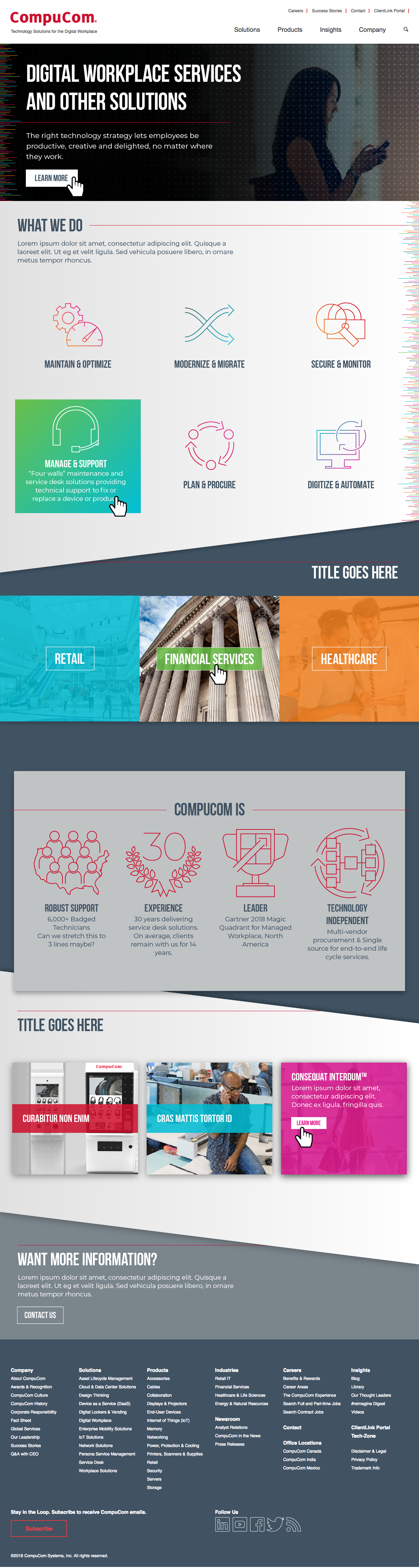
I was able to significantly liven up the homepage by integrating more color, adding angles to create movement and shadows to create depth, a subtle overlay on the hero image for visual interest, vibrant gradient rollover states, and colorful transparency rollovers.
The previous design used the old reds and blues from the former brand standards, along with Arial as the generic typeface. The new version incorporated the new branding colors, photography style, colored “data texture” lines, and thinline icon styles, as well as Bebas Neue and Montserrat typestyles.
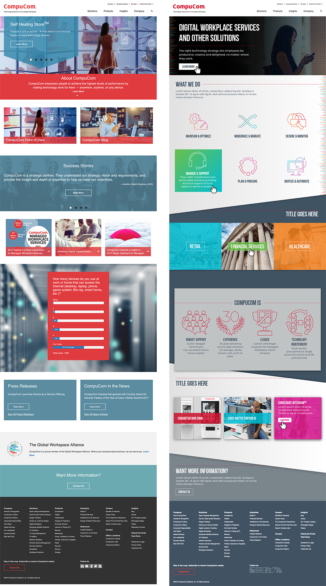
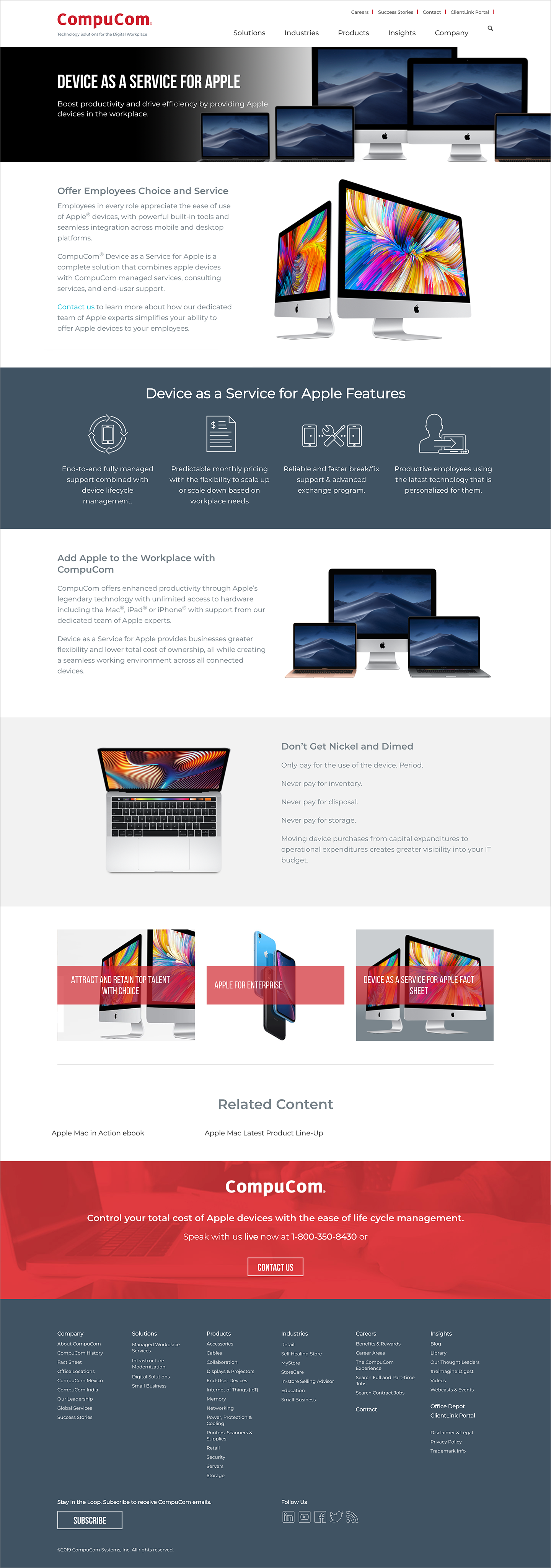
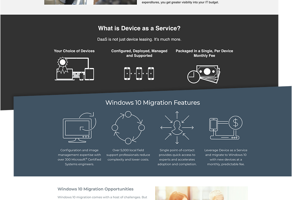
The inner pages were also freshened and cleaned up. We readjusted the header images to be consistent – many pages had different sized hero images, or even no image at all. We changed the fonts and colors to be in line with the new brand standards; we also began standardizing sizing and styling of imagery for consistency and branding. Since the large majority of our photography came from stock photography sites, we wanted to be more selective on the tone of the imagery we were using.

As we updated each page ongoing, we began utilizing a new icon library that I was developing, to bring more cohesion across the site. The icons previously in use were not from one single library, and lacked consistency; the new icons were a thinline style that echoed the multi-colored data texture lines that were a main element of the new brand.
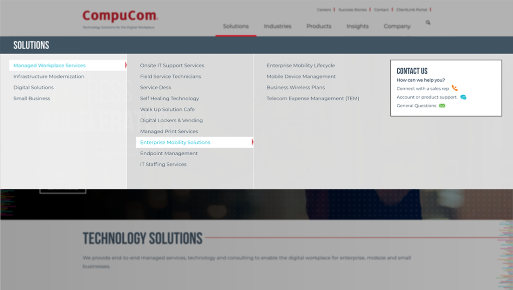
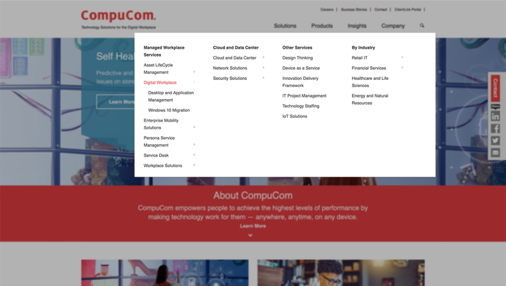
We also wanted to rearrange and simplify the sitewide menu structure and taxonomy. The previous desktop dropdown menu was a little bit glitchy in places, due to the manner in which the dropdown rollover states were set up. Instead of using dropdown rollovers inside the new main menu, I decided to use a flyout style option which improved the usability when moused over. I worked with the development team to implement these changes, as well as cleaning up the look and feel and updating to our new typestyles. (During this phase the mobile menu was left largely unchanged, save color and font updates.)