CompuCom Progress Accelerated Campaign Launch
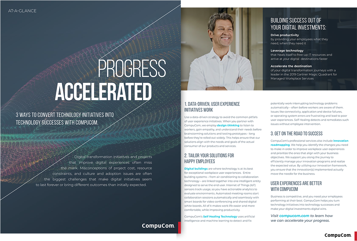
In 2019, CompuCom decided to launch a year-long campaign to better focus and consolidate the brand messaging. The theme of “accelerated” was adopted, with the overarching umbrella being “progress accelerated.” The creative director developed the main typographic treatment with the the diagonal lines, along with the image businessman in his office; I then took the artwork and created the assets that needed to be deployed across multiple channels.
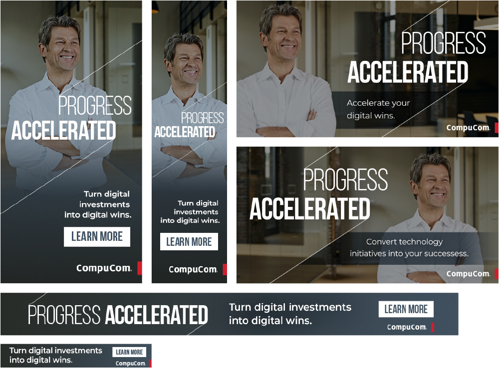
The initial push involved the corporate site, social media channels, and display ads among other media, and was to all be released simultaneously. It also coincided with an upcoming event CompuCom was scheduled to attend, so I developed the event graphics with associated print collateral.
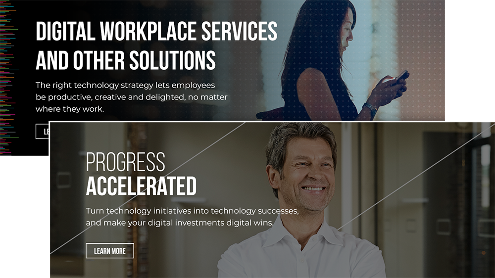
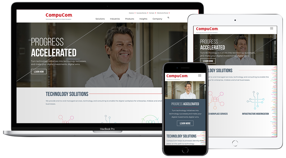
The main homepage banner required some tweaking to bring it into alignment with the new branding elements. I directed the efforts with the developers to achieve the needed typographic and visual changes to achieve this in a responsive layout. We created a secondary “Accelerated” template that could be applied when the featured content was Accelerated specific, and a standard one that could be reverted to when the image was more general CompuCom content.
As the diagonal lines that interact with the type weren’t something that could be quickly worked into the responsive layout using HTML5 and CSS, we decided to incorporate them into the images as a way to keep them visually integrated as best we could. The type was also not something we could have quickly changed to be right aligned (as it is in the original treatment), so we decided to keep it left aligned while using the lighter and heavier font weights for the first phase roll-out. We removed the cross-hatch overlay along with the multi-colored “data texture” pattern from the standard banner template.
Social Media and Display Ads
I also created some of the display ads and social media posts.
Event Graphics and Collateral
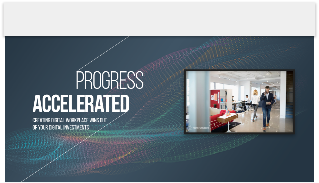
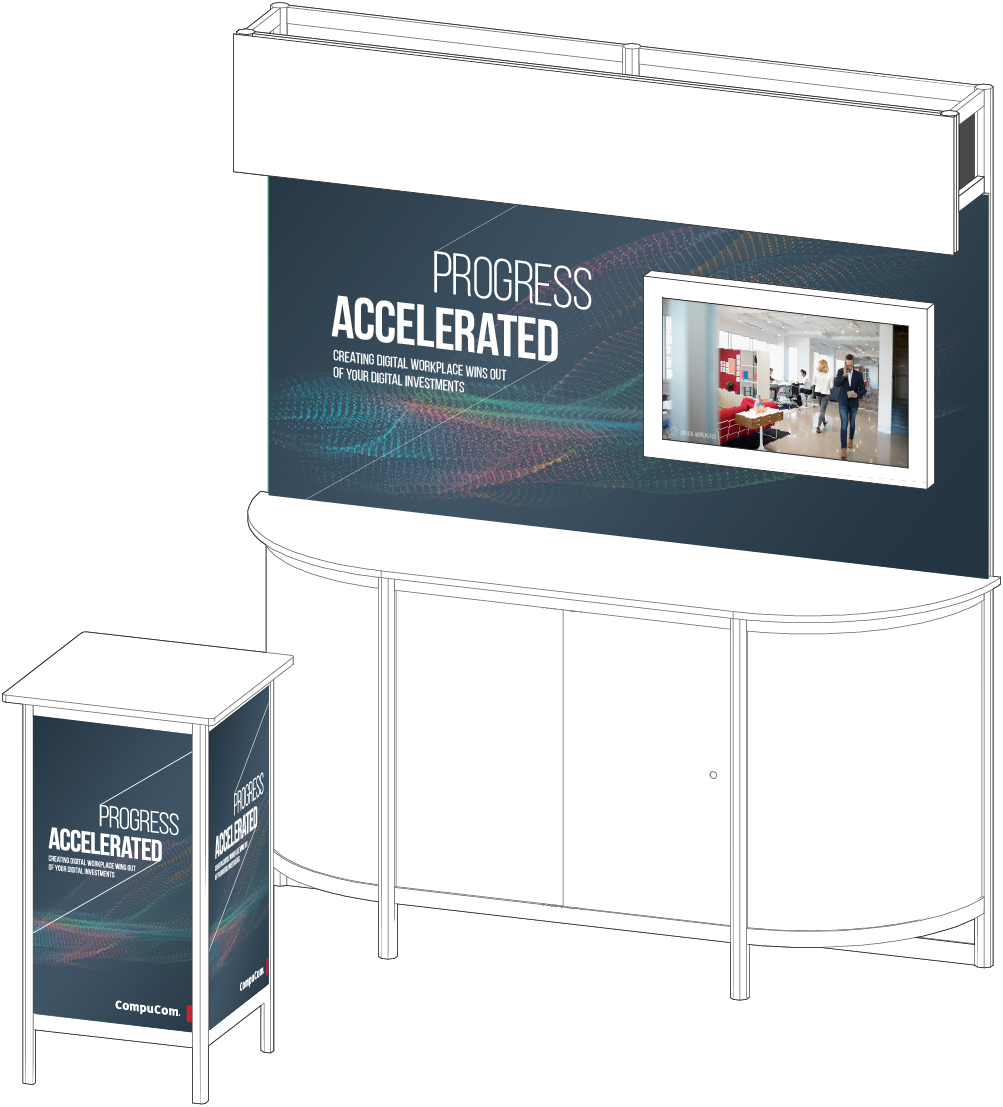
For the event booth we knew there would be a TV screen with a slide presentation running, so we wanted the background to be more subtle and less attention-grabbing so as not to compete with the screens. I went with an abstract graphic that moves forward and upward to reinforce the idea of progress; It was edited to bring it into the brand colors and used on the accompanying print piece for this particular event. I worked with our content team to repurpose a Google Slides presentation for the screen.
I used the abstract texture for the front of this print piece; to maintain consistency of overall “Accelerated” branding, the main businessman image was included on the back of the one-sheet event handout.