Ecrebo Site
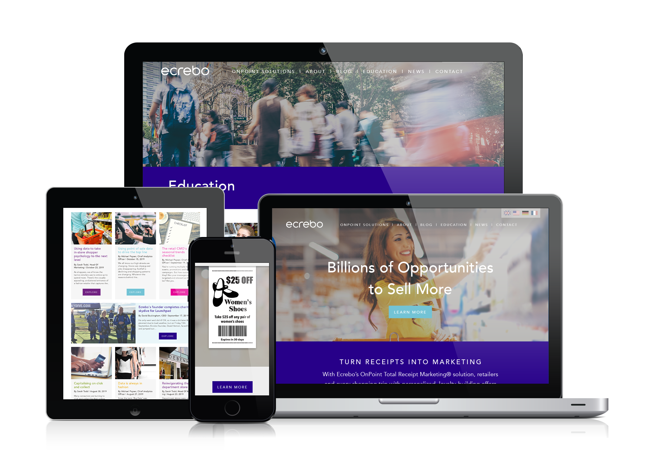
Ecrebo is a SaaS-based solution that empowers retail marketers to deliver personalized and targeted offers or messages via digital and paper receipts. Their Total Receipt Management® solution lets users design their own personalized receipts. Ecrebo’s Analytics tool allows for consolidating customer data across both POS and e-commerce into one place, enabling the user to plan marketing campaigns, create audience lists, and direct personalized offers to individual customers.
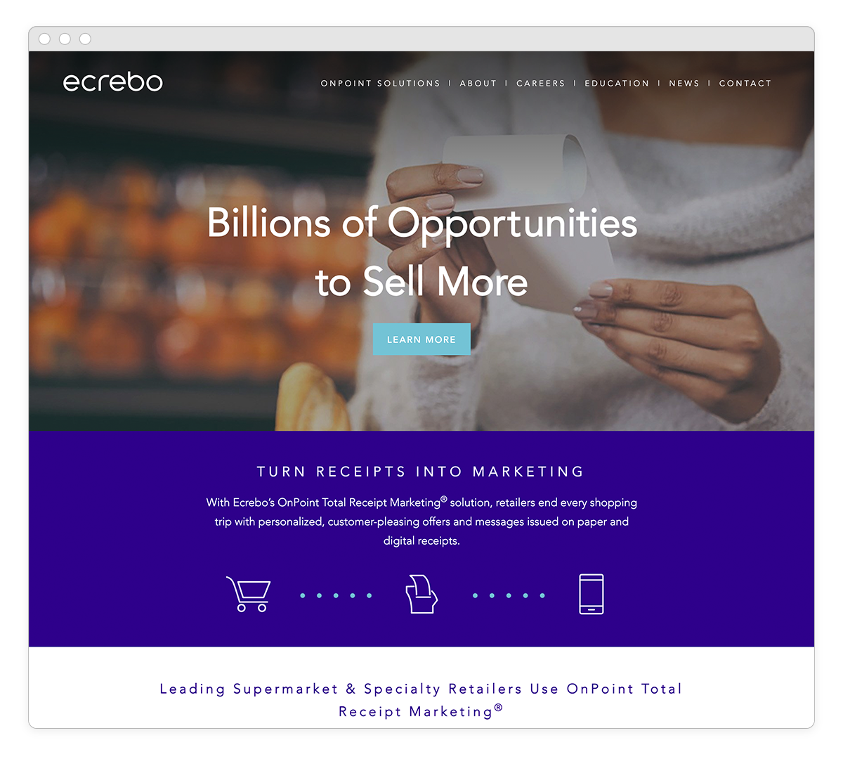
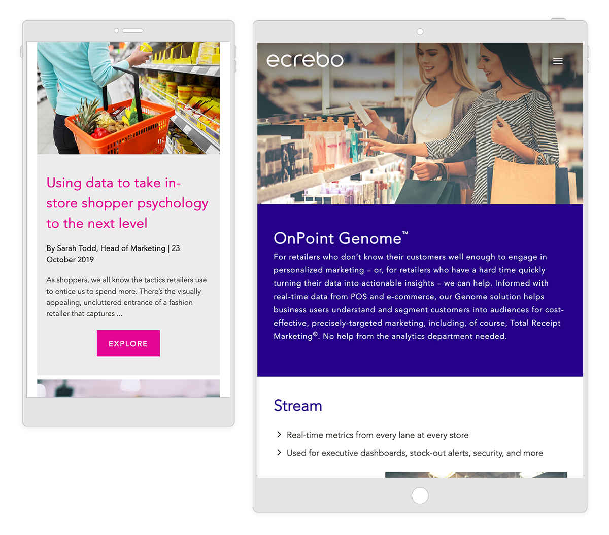
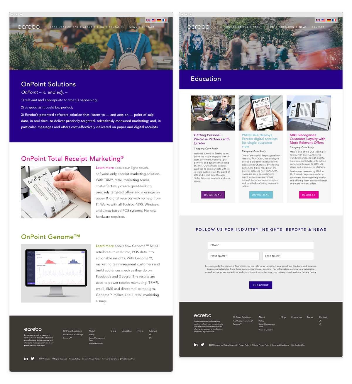
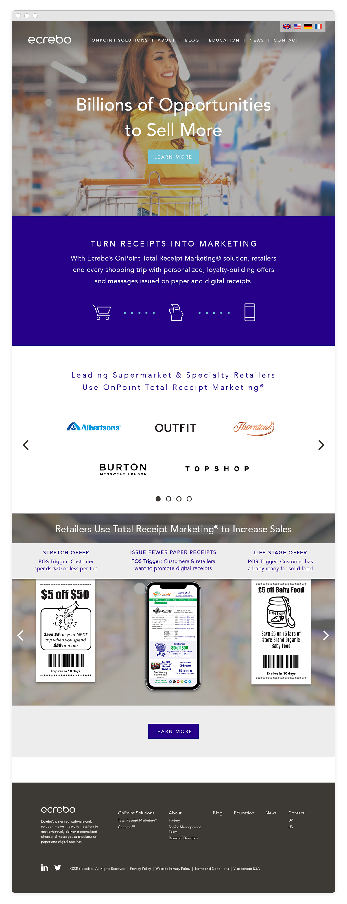
I worked with Tiny Horse Agency in 2019 to redesign the look and feel of the Ecrebo site. We also consolidated some of the information and streamlined the taxonomy just a bit. While the site previously had a somewhat clean and corporate look to it, we wanted to simplify further and rely on strong imagery, color blocking, and clean whitespace as the primary design elements. The final outcome was one that was still clean and corporate, without being sterile. The typestyles and colors used helped being a bit of life and “fun” to the table.

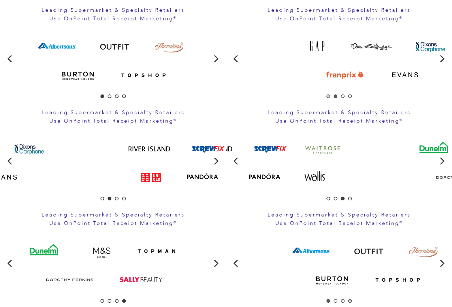
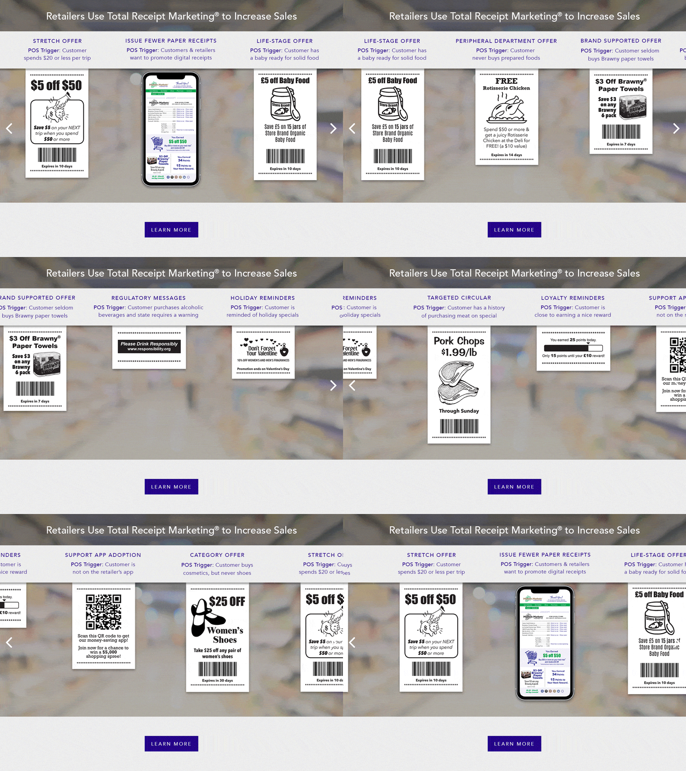
One point of emphasis was to find a better way to highlight the actual product on the homepage, particularly the printable and digital receipt function. We created a user-scrollable carousel that showcased some recent case studies of receipt marketing that had been successfully deployed by various companies. We also added a carousel featuring some of the major brand names that have utilizsed Ecrebo’s products across the globe.
Some Initial explorations
We explored a few variations on the new approach, keeping the same color scheme and typography, but changing up some of the details. I played with some of the design elements like header imagery, layout and gridding, and details like diagonal vs. straight lines, and tried out versions with more and less negative space to see which seemed to work best.
