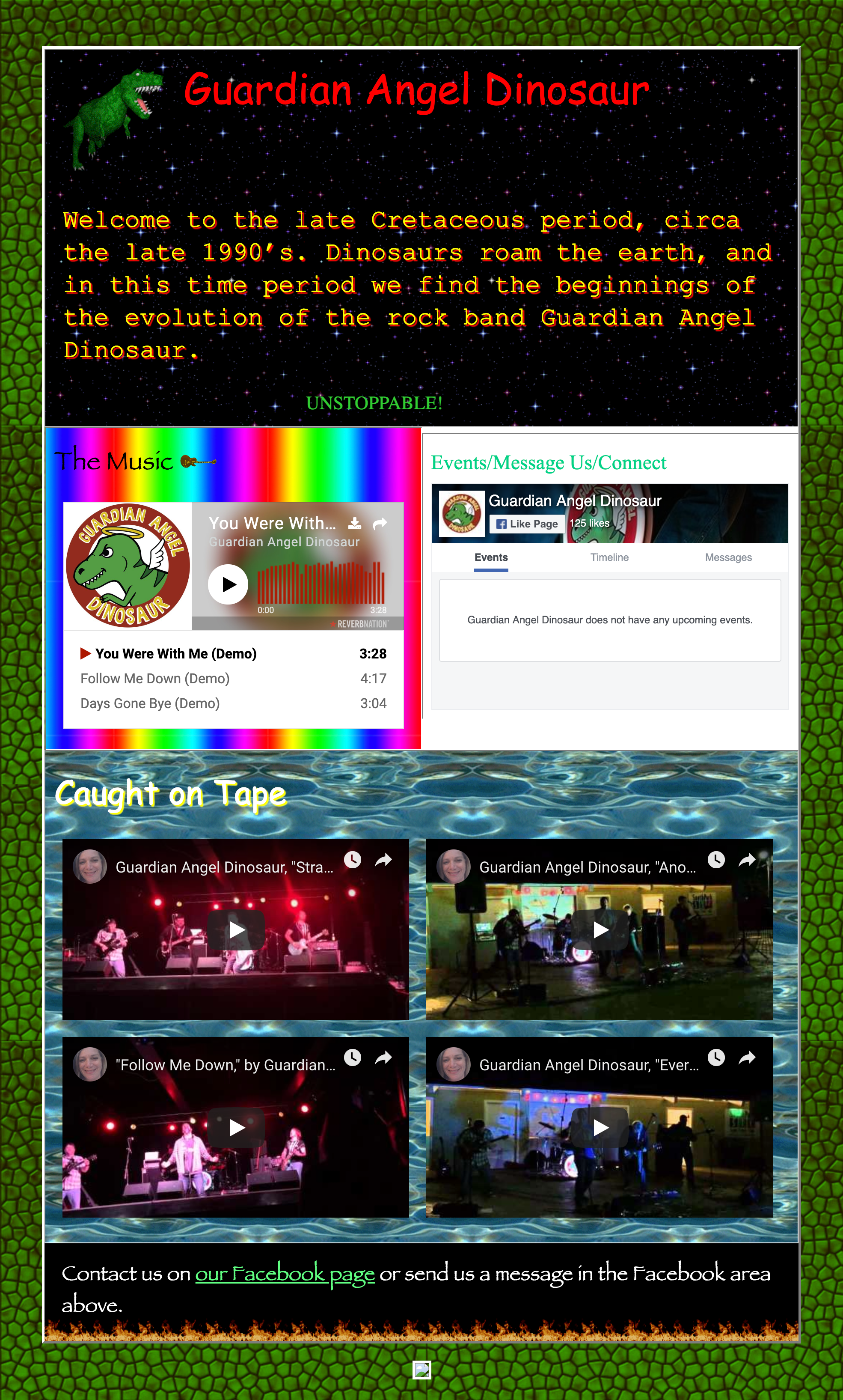
Guardian Angel Dinosaur (I Love the 90’s Version)
I play guitar in a band that started as a 90’s cover band, although lately we’ve been incorporating more original material as well. As we still have a 90’s alternative rock feel to our music, I wanted to revisit the “golden age” of 90’s web design in this satirical site. I was never able to convince the other guys to let me use it for real… (We have since changed out name to Zero to Give, so the dinosaur theme is no longer relevant.)
View Site
(Note: the social media links no function since the band changed our name.)

Here we have multiple fonts including Comic Sans and Papyrus, an overabundance of animated gifs, the look of old tables and cells, scrolling text, a bunch of glaringly competing patterns and colors, elements that don’t align quite just right, and even a fake visitor counter – basically a delightfully horrible revisitation to that 90’s Geocities look and feel.
This site is responsive and employs Facebook and ReverbNation technology, so it is built to current web standards with a 90’s veneer.
