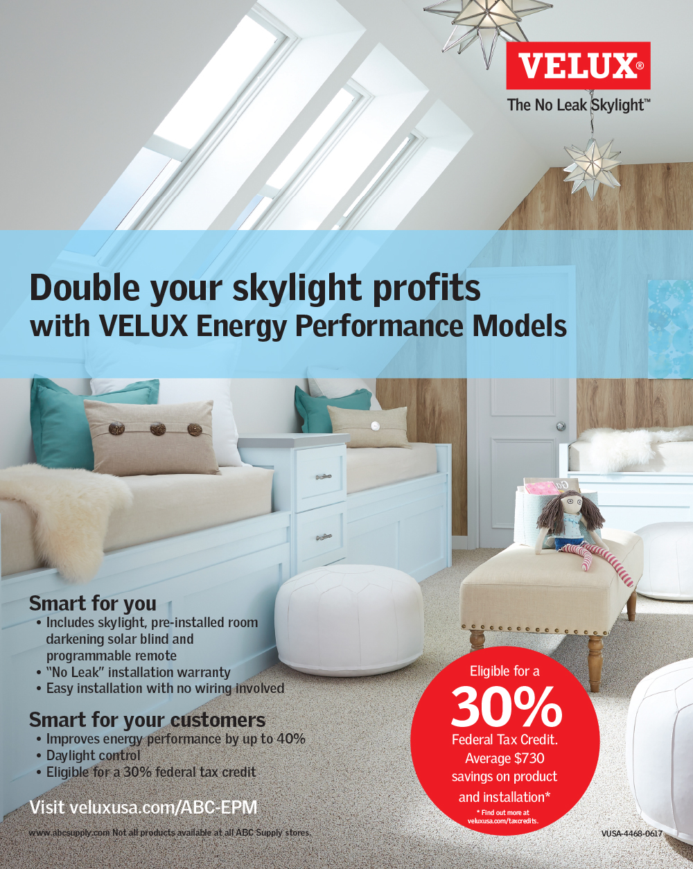
Velux Energy Performance Model Skylights Ad 2018
This is a re-design of a previous ad for VELUX America. It is to promote the residential VELUX Energy Performance Models skylights. This ad was serve as the baseline for the look and feel of Energy Performance Model collateral in print and online for 2018, and is intended mainly for an audience of homebuilders and contractors, although it is designed to appeal to homeowners as well. Several options were explored within the VELUX design standards – the previous ad for 2017 is shown at the bottom of this page, as reference.
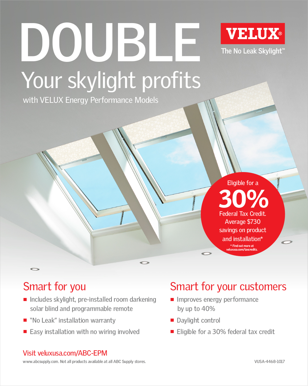
This option features the product prominently displayed against negative space, to visually feature the product and give some breathing room for the surrounding copy.
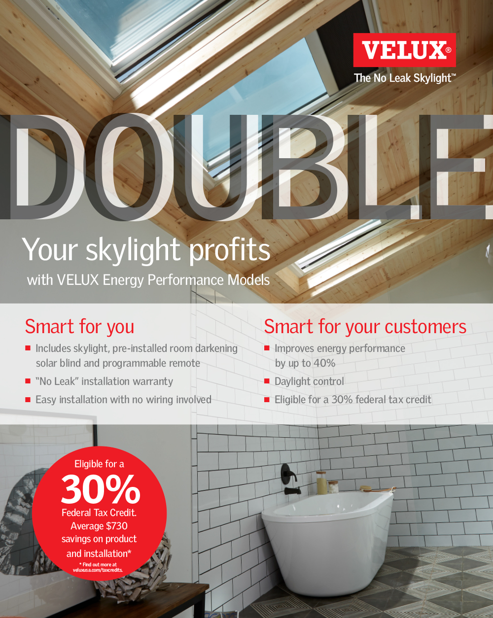
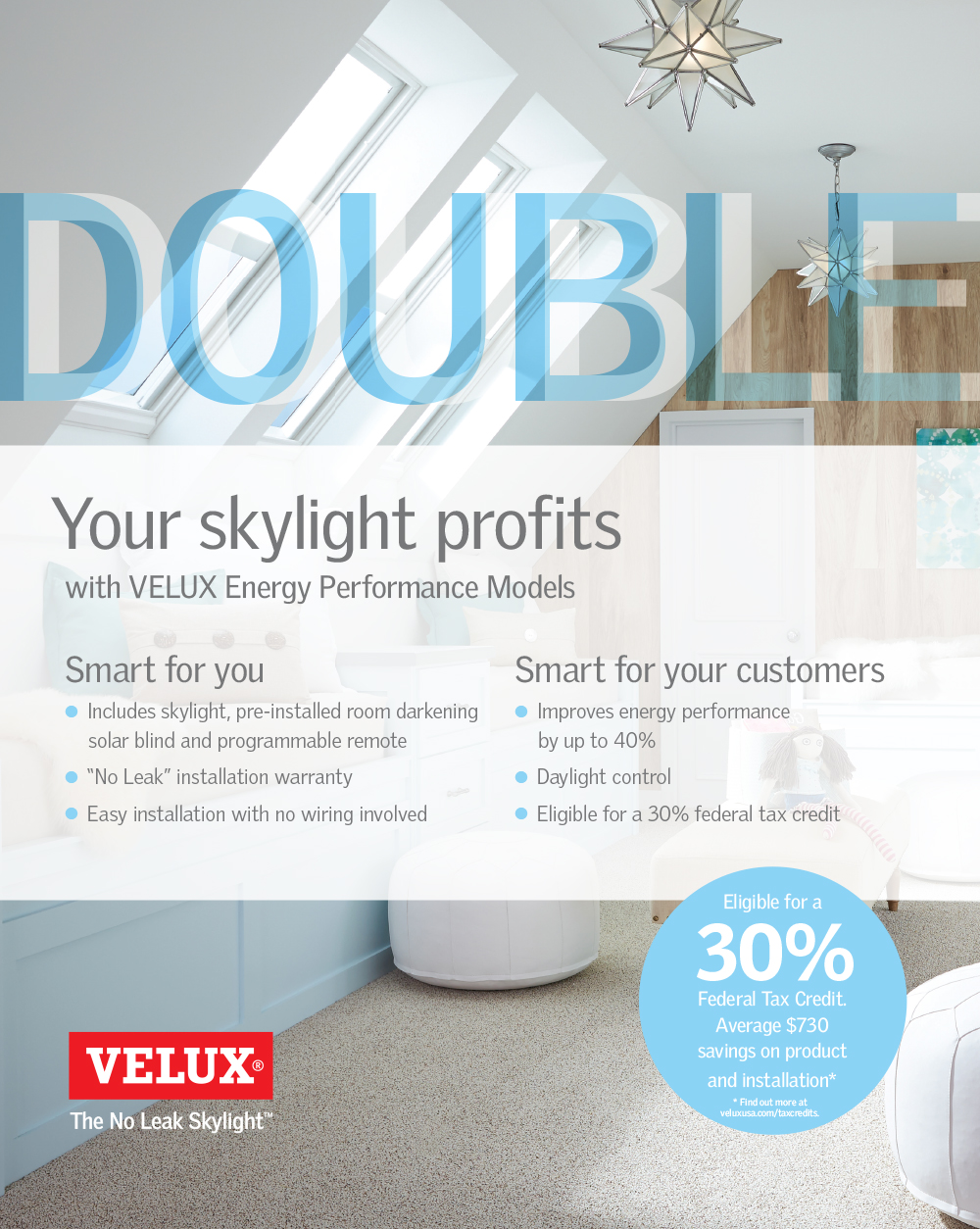
This option features new product photography, highlighting the skylights in context of the home, and showing how the added natural light can add to the house. It plays with some typography and the idea of “double” when it comes to savings.
This is another exploration that features the product prominently, which then leads the eye down to the negative space where they copy is set.
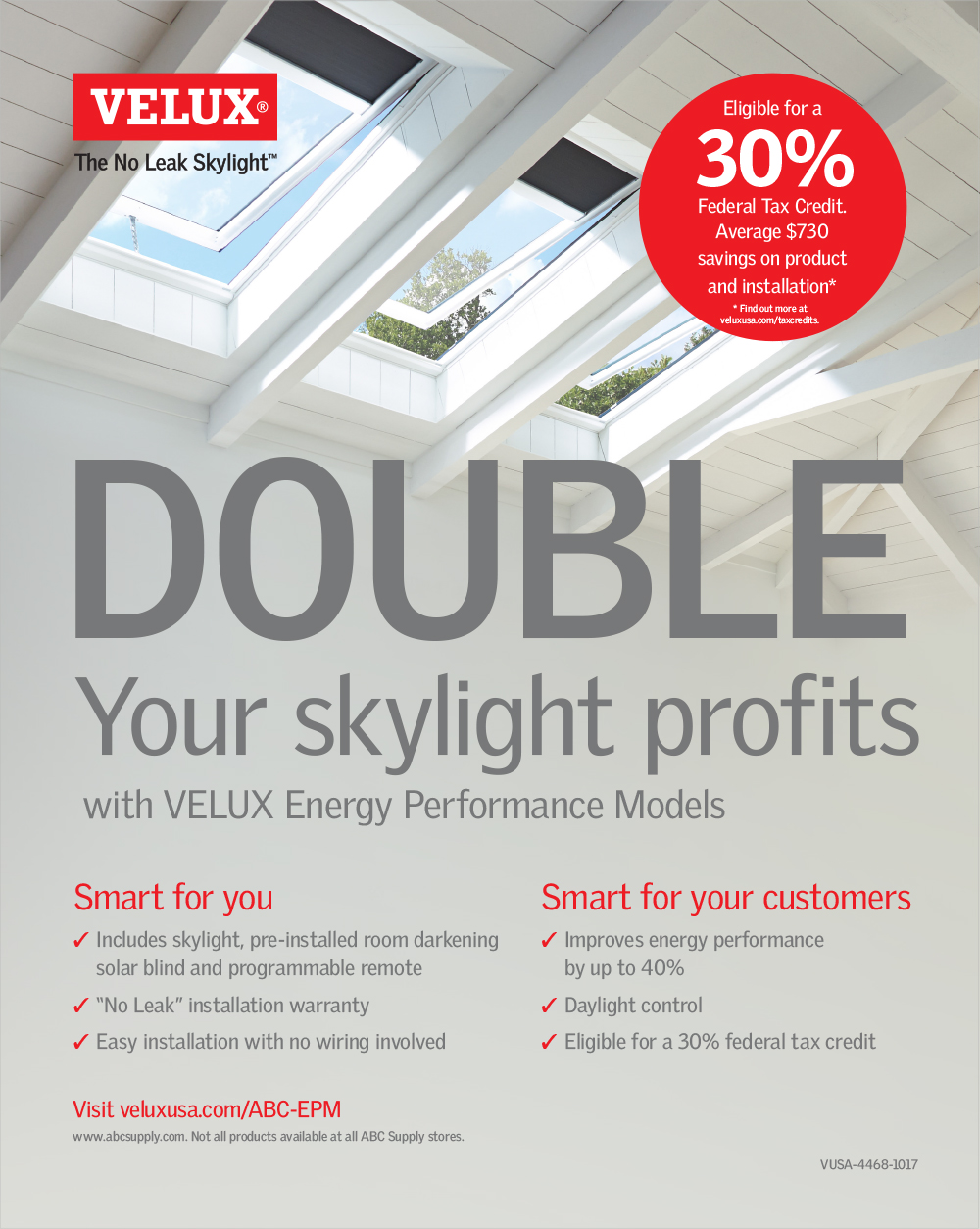
This idea is based on the previous ad, it uses the same imagery and similar color palette but takes a fresh and lighter approach. It also plays with the “double” savings idea with the use of typography.
Previous 2017 ad
