Rock The River Tour 2009-2011
The Rock The River Tour started in 2009 and was put on by the Billy Graham Evangelistic Association. It was geared toward a teen and young adult audience, and featured bands like Red, Skillet, and Flyleaf.
Rock the River Tour Creative Concepts
These are original logo and poster design concepts for the inaugural of the tour, which started in Baton Rouge, LA, and travelled up the Mississippi River stopping in St. Louis, MO, Quad Cities, IA and IL, and ending in Minneapolis, MN.
Poster Concept
The silhouetted graphics came from photography I shot at previous concert events.
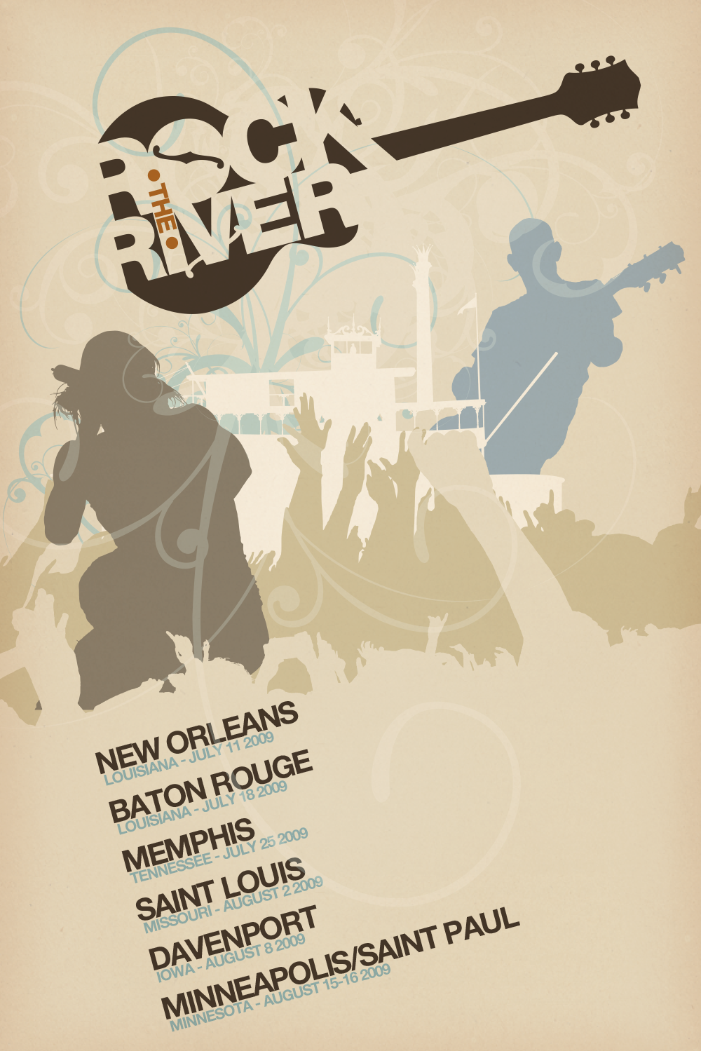
A different direction was eventually selected for the overall tour branding, but some of these concepts made their way into the tour’s branding elements.
2009 Pre-tour website
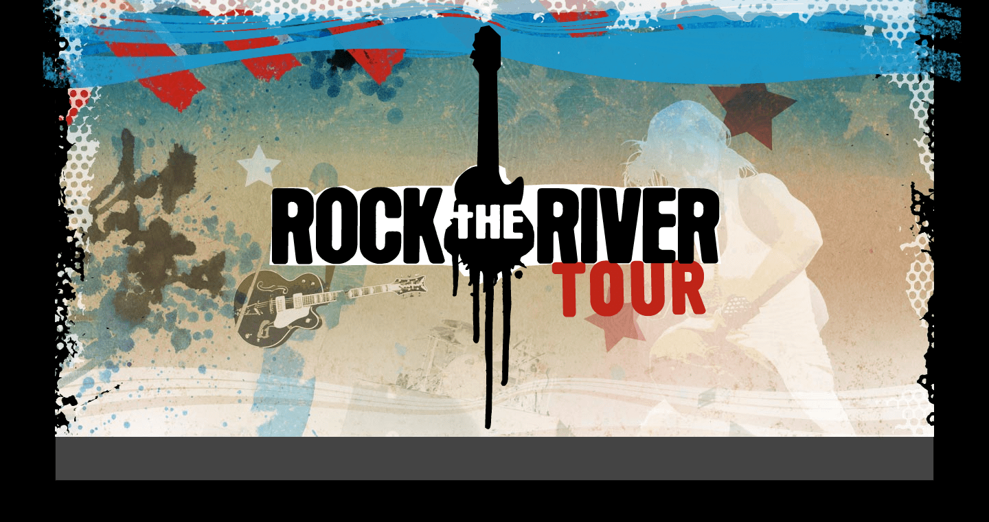
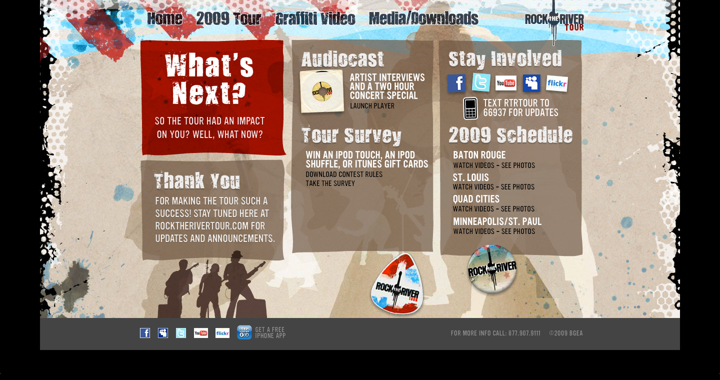
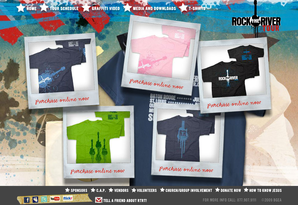
The Rock The River Tour started in 2009 and was put on by the Billy Graham Evangelistic Association. It was geared toward a teen and young adult audience, and featured bands like Red, Skillet, and Flyleaf. This overall project consisted of an original design for the website, starting with a basic promotional Flash site before the venues and artists were finalized, and went through six different iterations as the tour was planned, while it was ongoing, and after it had wrapped up. Along with the website, graphics and content were developed for Facebook, Twitter, YouTube and MySpace, as well as graphics for the screens in the venue the day of the tour dates. These included the capability to interact via mobile media using the Mozes texting platform – spectators could send their text messages and photos to the screen, as well as sign up for the Rock The River Tour mob to receive updates on tour events on their mobile devices. Several different Rock The River Tour t-shirts were created along with the site and venue graphics, and were sold both online and at the concert dates. Photos from the day of the Tour stops were uploaded in real time to the website as well as Facebook pages, and videos shot and edited on-site by the BGEA video team were uploaded in real time to YouTube as they were completed.
Post-tour website
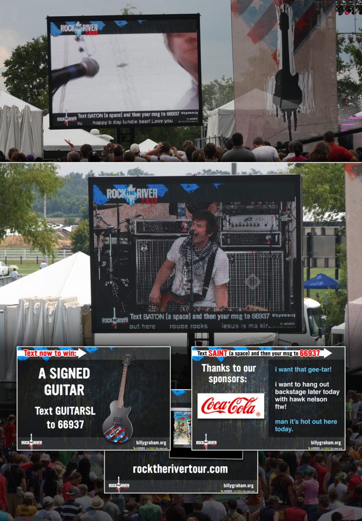
In-Venue Screens
These were screens that displayed in-between each artist performance, displaying text-to-screen information and interactions, sponsor information, and general venue information.
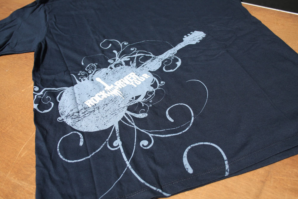
T-shirt Designs
Rock The River Tour West 2010 Website
The Rock The River Tour West in 2010 was the second year of the summer event hosted by the BGEA, visiting Vancouver, BC, Calgary, AB, and Edmonton, AB.
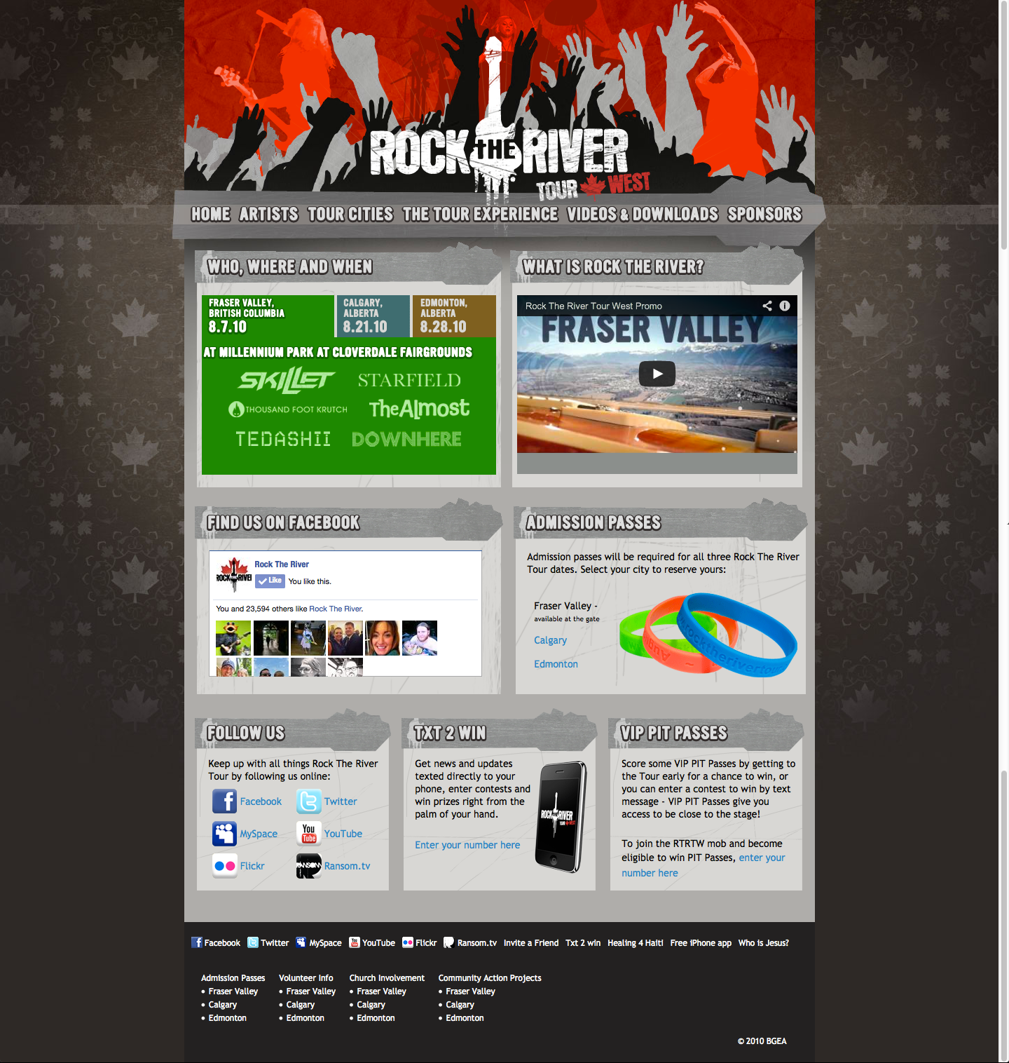
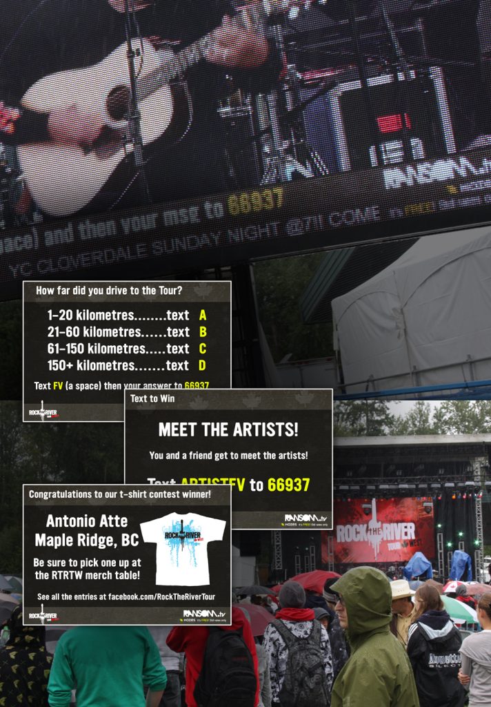
The Rock The River Tour West in 2010 was the second year of the summer event hosted by the BGEA. This year the tour went to Vancouver, BC, Calgary, AB, and Edmonton, AB, and picked up where the 2009 Tour had left off. The 2010 RTRT project involved the creation of a new, more flexible non-Flash website (save the homepage header image), as well as maintaining the same level of activity on Facebook, Twitter and Youtube, and in mobile media using the Mozes.com platform. Graphics for the screens at each venue were created, as well as graphics for the BGEA video department to use on a live stream that was shown on Ransom.tv. This year, Ransom.tv merch was designed to be given out as prizes both at the tour and online via social media contests and texting contests, prior to and following the tour. This included stickers, t-shirts, water bottles and bags using the Ransom.tv branding. Ransom is a site created by the BGEA for the same demographic, featuring content from similar artists, musicians and personalities as were on the Rock The River Tour. (The silhouetted graphics in the headers came from photography I shot at previous concert events.)
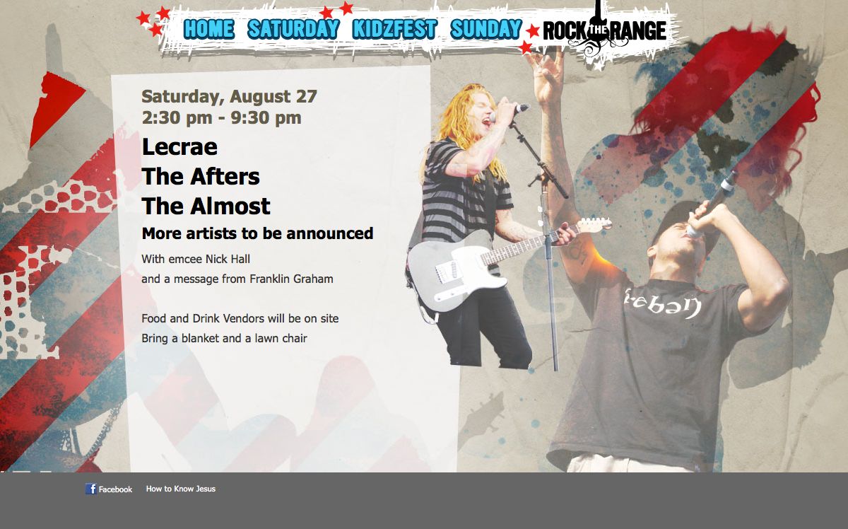
Rock the Lakes and Rock the Range 2011
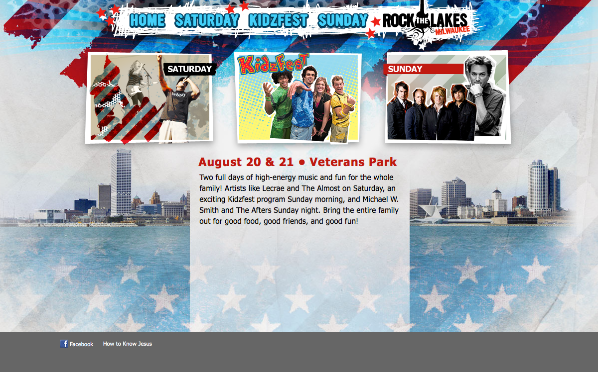
Rock the Lakes and Rock the Range were part of the third year iteration of the Billy Graham Evangelistic Association’s Rock the River Tour series. They were held in Milwaukee, WI. and Denver, CO. These are the promotional websites for the events; they were simplified and streamlined from the past years’ sites. Flash was done away with to modernize them and the layout was re-purposed to be in a single-page site design. The basic look and feel of the previous years’ events was kept for brand continuity, while undergoing some graphic refreshing.
Rock the Lakes Website
Rock the Range Website
